Over My Shoulder… Making Hot Rod Art
Over My Shoulder… Making Hot Rod Art
Written By Tom Fritz
One of the side benefits of working at my art is that I’ve been blessed with the development of an extended family of very close friends, a rich variety of both men and women who support me in my self-inflicted torture. And as sit here in front of yet another blank canvas trying to figure out the combination of what I am and what the world needs, I’m reminded of all the conversations in which I’ve been asked, how hard is it to make my art, or how long it takes me to make it — in which they try to get a handle on how I put a painting together.
“…lets face it – starving can become a nuisance. .”
These questions invariably come up at shows and in order to portray the illusion of credibility in a compressed time frame, I use convenient phrases like “it really isn’t so hard.” But honestly, it really IS hard work. After all, evolving an image and style can take a long time and can be, at times, a hellish nightmare.
So, I figured I’d allow you to sit and watch over my shoulder for the first time ever in a published format as I weld together a story of image, paint, color, and technique, and hopefully do so with a forceful result. I’ve never done this before, and the one thing I don’t want to do is give you all a step-by-step, here’s-how-I-mix-this-color art lesson. I’ll leave that to the television artists.
To begin, I’d been scouring events earlier this year looking for an example of a front engine dragster typical of those I remember from my youth. I REALLY want to put something together with one of those.
Remember I mentioned that my process could be painful? How painful can it be to put an image together? Well, it seems to be ingrained in the motor sports arts that every painting has to “be of someone or something” – that every painting has to contain specific history and other incidental baggage, which is something that I really don’t care to drag along. When I was young, the thing that really kicked me in the zipper about the whole wang dang doodle was simply this: metal making noise. To this day, it remains the prime visceral element that I respond to and the main thing I try to accomplish in my work. I’m presenting a time capsule that contains the same raw, core experience I remember and digested as a kid. In fact, I think this is still the thing that sucks us all through the turnstile. After all, I can’t believe we just go to the races to enhance our memories of who was driving what, when, and where so we can go hot-dogging at the bench races.
The point for me, then, is to find a middle ground between form, content and story telling that I feel comfortable with. I’m trying to put on canvas something intangible, invisible, and something that exercises my observational sensitivities and aesthetic taste. And I want to create an exciting image no one has ever seen before – an image with a point-of-view no trackside photographer could have snapped.
Can you now understand why it’s pretty easy for us artists to work from a photo taken by someone else? I understand this, because let’s face it – starving can become a nuisance. But besides surface-level copyright infringement, there are even bigger issues for me.
First, I’m an artist. I need to create. I don’t want to just color an old photograph. Sure, I use the old pics for reference, whether it be historical tidbits, a “jumping off” place, or for inspiration… but not as the basis of my image. Photographs record detail. My job is to take elements from a photo, and from them make a subjective, aesthetic statement to evoke a particular emotion or mood. Besides, the old photos (which in the motor sport realm are mostly “snaps”) hold visual traps that most artists unwittingly fall into, unknowingly painting in distortions and compositional weaknesses inherent in the image.
Another thing. That lucky artist that went through the shoebox first snagged the most dramatic images, leaving the chaff to the rest of us. So, then I have to ask myself if I’d really want to paint something someone else already painted? (Sheesh, how many renderings of Bob McClurg’s 1972 photograph of Wild Willie Borsch in the “Winged Express” have we seen?) And then, I wonder why I’d want to paint all the leftover images that aren’t really all that great to begin with?
Therefore, I brutalize myself to come up with the hard stuff.
Enough talk. Time to squeeze out some worms of color, sharpen the brushes, and bring on the pain. Pull up a chair, kick back and join in the madness. Watch out… some say the oil paint fumes make them intoxicated (you’ll notice I don’t hold my breath while I paint).
One more thing. I’ve got my camera here, and understand I’ll have to “pull” myself out of the altered state of consciousness I fall into when I paint every so often to take a picture of the emerging image. Sort of like waking up from a dream state. Lessee how this goes…
Pah-rooz these reference photos I took…
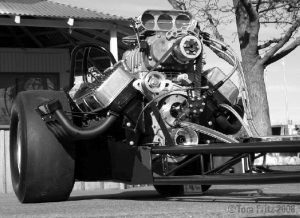
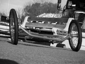
What a mess, right? They’re black n’ white photos, there’s nobody straddling the rear axle, the throttle plates are closed, the tires are obese, and the header tips are covered. Also, there’s a lot of stuff in the background like park benches and trees. And this isn’t a “hero” car, for chrys-ache. Where’re the stands with all the people? Where’s the Christmas tree, the fire extinguisher, the tower? (Just about now, that “path to temptation” pointing to the shoebox of old photos is starting to look better and better…)
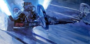
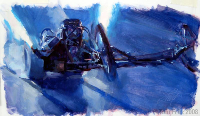
Back in the studio, I take a rare free moment between projects and put out a small quick-n-dirty thumbnail to see if I could translate the image I see in my mind into reality.
Usually I don’t take this step, opting to go direct-to-canvas instead. But this time I wanted to verify my intention to limit myself to a decidedly monochromatic, cool color scheme. In my sketch, the left front wheel protrudes beyond the image boundary, which compositionally stabilizes the subject, tying it into the frame. You can see that I have to work out issues of lighting, as I now have multiple light sources (two spectacular white plumes of burning hydrogen as well as ambient lighting) as opposed to the one light source I have in my reference photos (the sun). Some parts of the car in my sketch stand in front of my perceived light sources, some are beside a light source, and other parts are just filled, again, with ambient light. And to top it off, I have to translate how my eyeball experiences violent motion in buttery oil paint, without relying on convention (Dang! That shoebox of old photos just keeps looking better all the time…)
After preparing the canvas, I lay in my image, keeping my line work loose and broad, preventing me in being too much of a slave to my reference. Once I’ve done my sketch, I start applying my initial washes. I don’t do this tentatively; I really hunker down on that thing. These washes are laid in with thinned paint and a big brush, and the tones are lightly washed in transparently to cover the whiteness of the canvas.
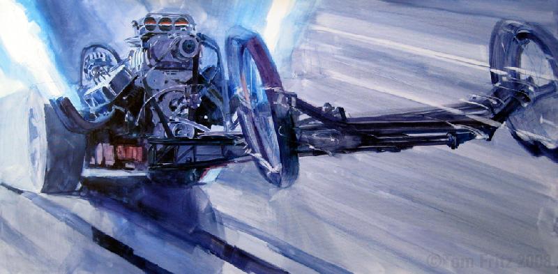
Here in these detail photos, you can see some of my initial line drawing and washes, done both with pen and brush.
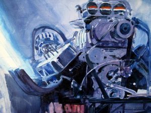
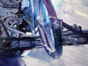

I work on the whole canvas at once. It’s pretty direct. Every stroke relates to the whole. I don’t start in the upper right and work to the lower left, after all, there’s a great joy in watching the painting come together all at once. Now here’s a look at the canvas on the easel, the morning after the first session. The painting is 42 inches wide by 21 inches high.
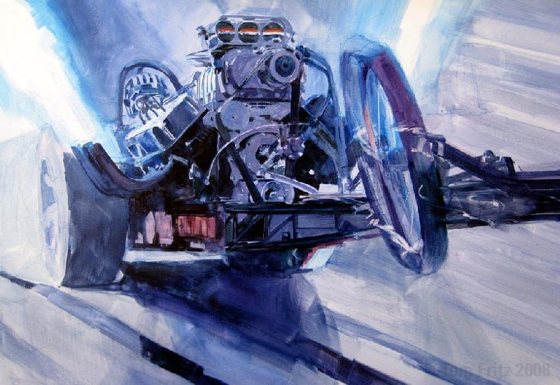
At this point, the painting is going together pretty smoothly. I constantly keep things moving around, making sure nothing calls attention to itself. However, something is up… look at the top of the right front tire in the progression images. Notice there is a ghosted tire that disappears, only to reappear later?
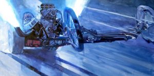
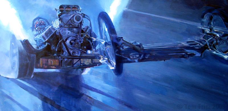
Either I’m overdosing on fumes, or this is clear and present evidence of rampant imagination not being tied down to a paint-by-number approach. Try something here. No, take it out. Wait, I liked that – bring it back. Just me peeling another layer of ass off myself as I paint. Oh, the agony…
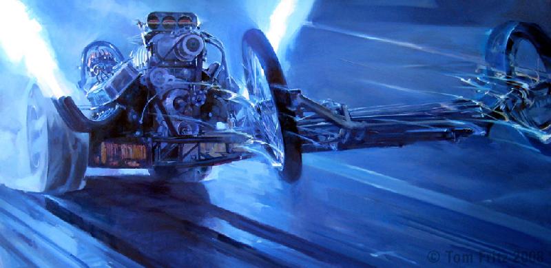
Look how various other parts of the image evolve, how the shape of the exhaust plumes develop. Notice how I translate the spinning front wheels into paint. I try to create something authentic, not derivative, so I disregard cliché and try to find my own answers. The brush strokes become smaller in those areas I’d like your eye to pay attention to. I’m not much for painting every slot in every screw head. That level of detail just calls attention to itself. Rather I activate areas by placing small, colorful paint strokes that are tied to intelligible forms and resolve into suggestive detail in the viewer’s eye.
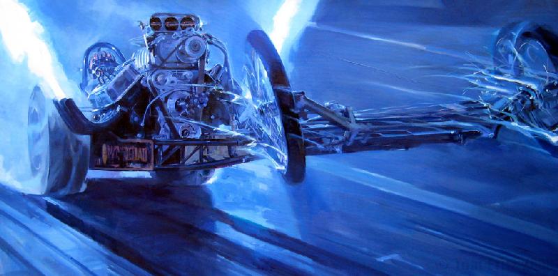
Check out how the decal arrangement on the side panel below the headers has progressed. These are merely color hits that “read” as decals and text (we call it “greeking” – you can’t read it, but you know it “says” something). I’ve brushed in a light colored circular element on that panel because my eye tells me it needs to be there. Also, you see incremental changes. “Tightening up” the front end and front wheel areas, and also around the rear tires.
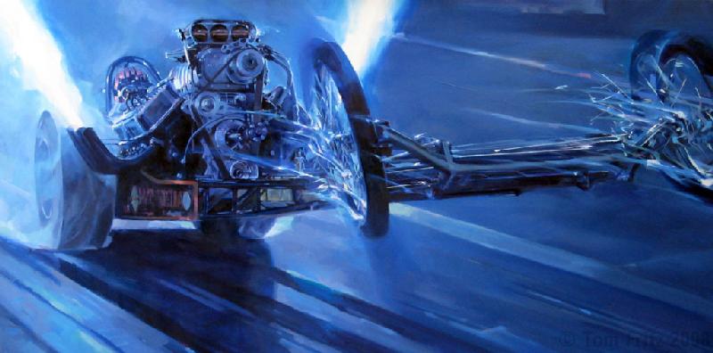
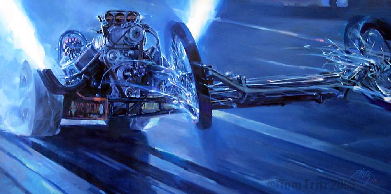
Finally, the long chain of decision-making comes to an end, and here’s the result. How do I know when the painting is completed? When there’s nowhere to put the next stroke. It just subtly let’s me know it’s done. The actual brush-to-canvas on this one took about 40 hours.
What’ll I call it? “Quick Sombish”

Lean it up against the wall, rest the eyeballs a bit, then on to the next one!
Here is a full Gallery of the workflow.

Recent Comments